FLUI Design Hackathon — Banana Art Lab
In February 2025, our team of four participated in the FLUI Design Hackathon — a 3-day design challenge where we partnered with Banana Art Lab, a Vancouver-based creative studio offering tufting, decoden, and DIY workshops. The existing site had no clear booking flow, inconsistent branding, and a confusing navigation — making it hard for first-time visitors to understand what the studio even offered, let alone book a session. We were tasked with redesigning it from the ground up: clearer booking flow, stronger brand identity, and a more cohesive visual experience — all within 72 hours.
Before diving into design, we audited the existing Banana Art Lab website and identified 8 core issues that were creating friction for users — especially first-time visitors trying to book a service.
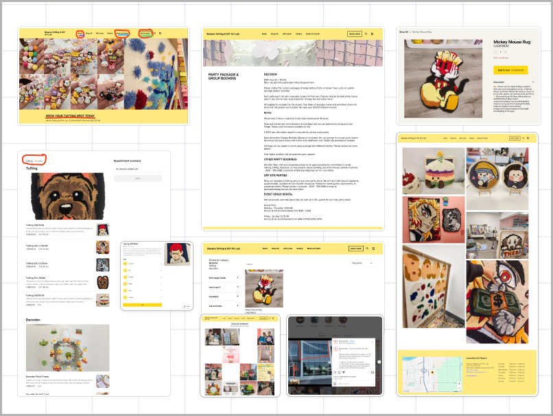
2. Long scrollable list mixed tufting and decoden sessions without clear separation. Inconsistent text formatting (e.g. "70X70CM" vs "100 x 100CM").
3. Information overload on the party booking page — dense text, no contact form, key details buried at the bottom.
4. Misleading "Book Now" button led to a pre-made rug shop instead of a booking flow — frustrating for new users.
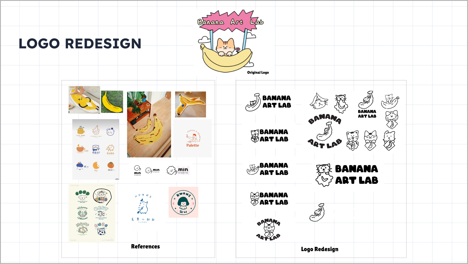
5. No clear brand identity — the logo and visual elements lacked cohesion; the site didn't communicate what Banana Art Lab is at a glance.
6. Product listing issues — price shown twice, vague descriptions with no clear call to action.
7. No professional map or directions — location guidance was just a photo with a hand-drawn red line marking the 2nd floor entrance.
8. Instagram photos used as gallery — no curated visual showcase of the studio's work.
Within the team, I owned two main areas: the booking system user flow and visual illustration work.
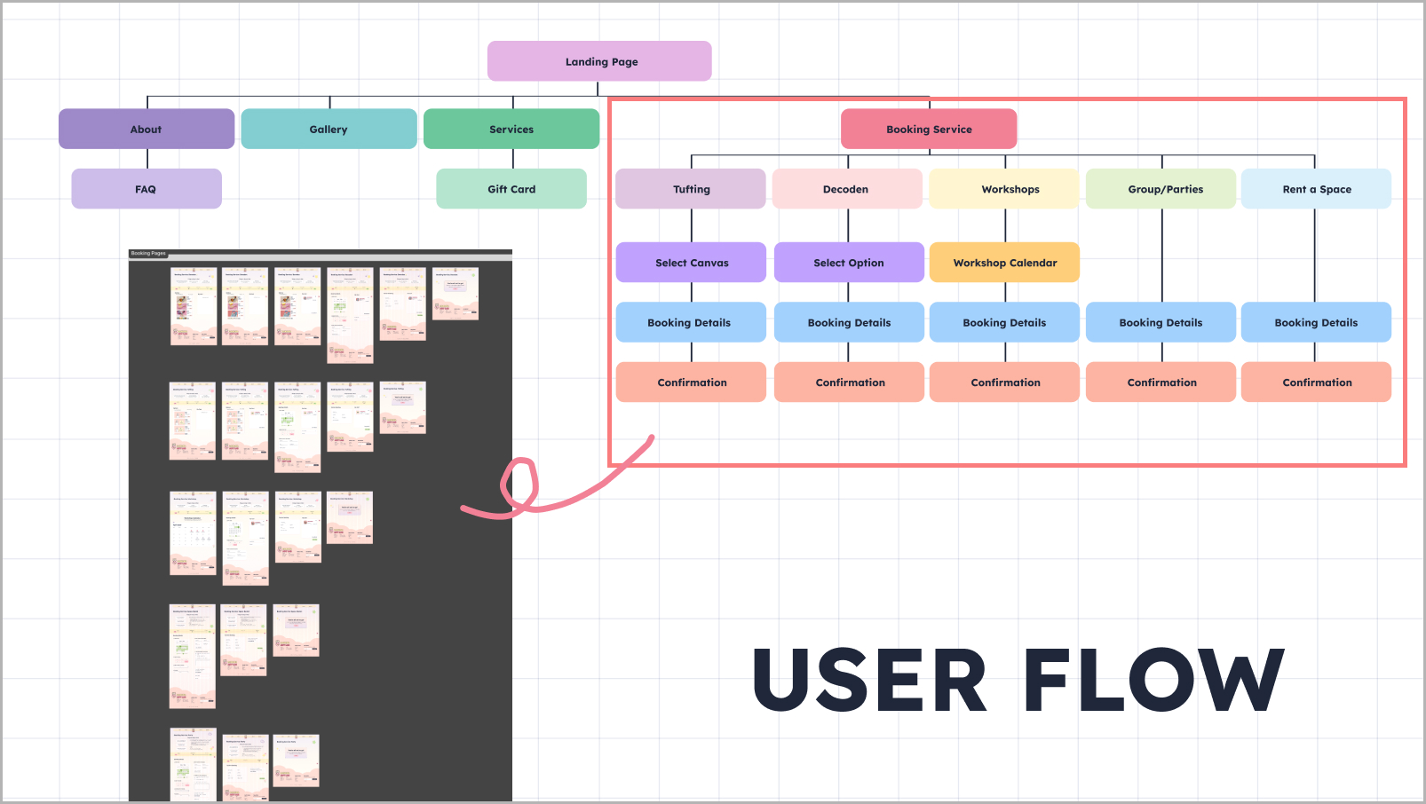
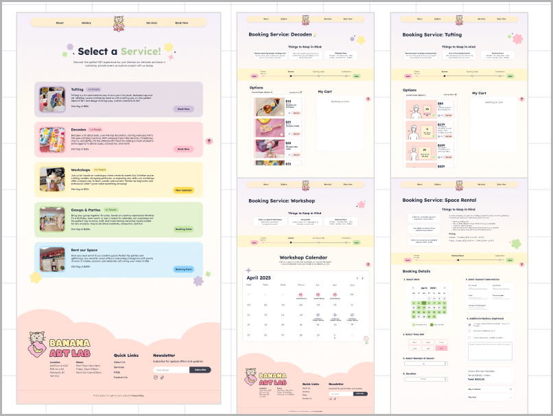
For the booking system, I mapped out how five distinct services — tufting, decoden, workshops, groups & parties, and space rental — could each have a consistent, step-by-step booking structure without feeling repetitive. The goal was to make each flow feel familiar while clearly reflecting the differences between services.
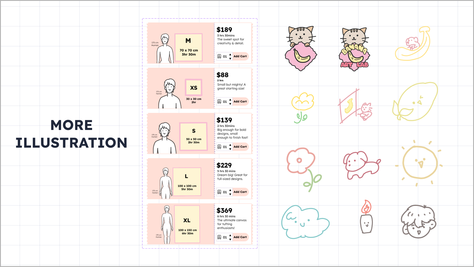
For illustration, I created custom visuals including a canvas size comparison graphic that the original site completely lacked, giving users a clearer sense of what each service involved before booking.
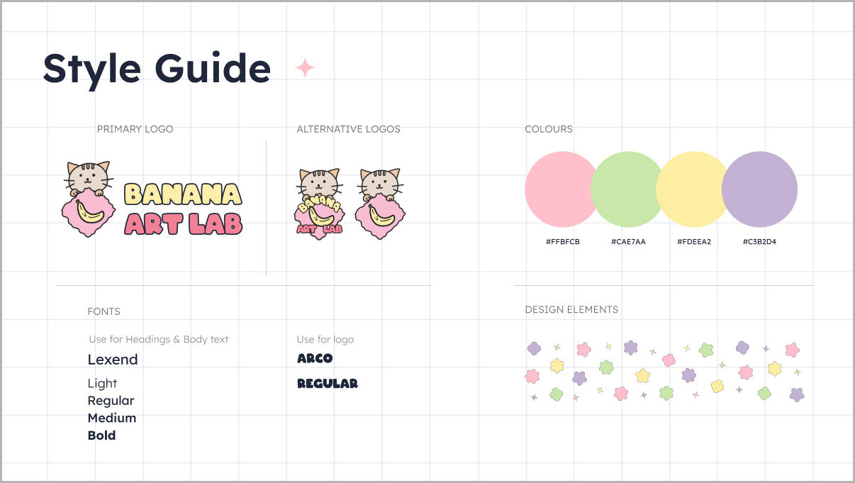
To reflect the client's request for a bubbly, playful aesthetic, we developed a full style guide — new logo, color palette, typography, and custom illustrations. I designed the new logo and created original illustrations used across the site, including decorative elements and service-specific visuals.
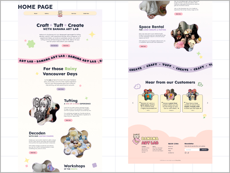
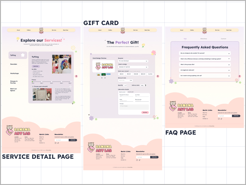
The redesigned site introduced a clear service selection page, a step-by-step booking flow for each of the five services, a gift card feature, and an FAQ page — all consistent in layout and visual tone.
We had one client meeting, a short brief, and 72 hours. Here's how we divided it:
Audited the existing site, identified pain points, held a team alignment session, and mapped out the scope of the redesign.
Day 2 — Design & Build
Divided tasks: I owned the booking user flow and illustrations while teammates worked on the home page, service pages, and style guide. Constant check-ins to keep components consistent.
Day 3 — Refine & Present
Iterated based on mentor feedback, connected all screens into a functional prototype, and prepared the final presentation.
Interact with the full prototype below — explore the home page, service selection, and booking flows.
Three days is short enough to feel the pressure, but long enough to learn what actually matters. I came away with a clearer sense of how to prioritize fast — not everything can be perfect, so you focus on what users will actually touch. Working in a team under a real client brief also showed me that alignment early saves time later: the 30 minutes we spent mapping the booking flow on Day 1 prevented a lot of confusion on Day 2. That realization — that 30 minutes of alignment saves hours of rework — changed how I approach any collaborative project.